Midterm User Testing
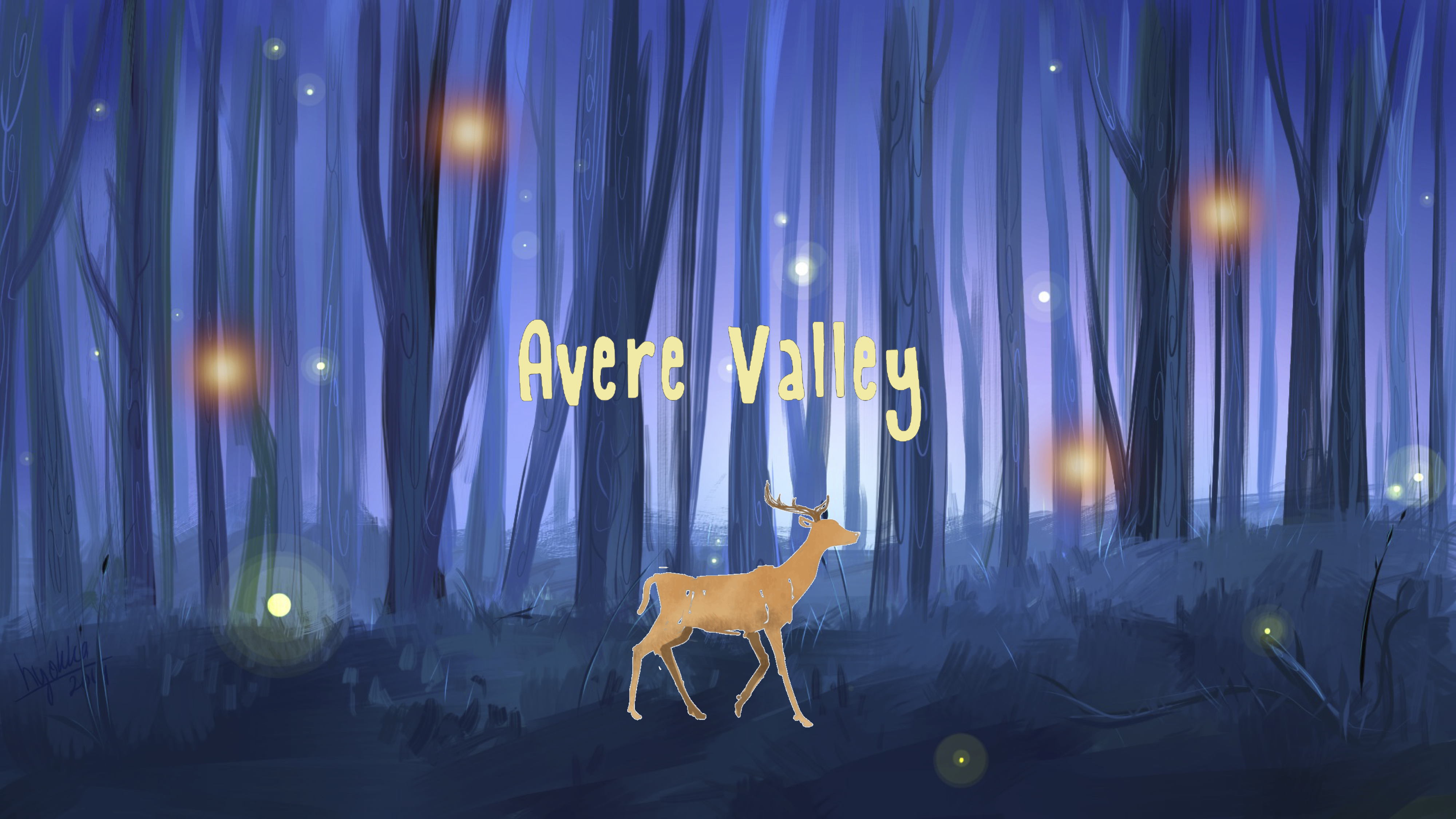
I displayed my animated homescreen for my user testing. I had an animated deer, a drawn forest for my background, and four different light orbs spread throughout the page that'll link to four different fortune telling methods. One trouble I had was figuring out how informative my homepage should be. I asked each group that user-tested my site if I should inidcate which country each orb led to through a hover-over text or graphic, and half of them said yes while the other half said no. Those who said I shouldn't said that it would be more mysterious and fit the atmosphere of my project more if I didn't let the users know what he or she was getting into, and I agreed with this point. Based on these mixed responses, I decided I won't indicate what page each orb leads to, but I will make it animated so that users know that it's a clickable object. Another suggestion was that instead of making a separate background for each fortune page, I can just blur the homescreen and only add a picture of the fortune telling object, therefore, saving me more time in drawing the graphics. Based on how I progress with my drawings, I will implement this method, or a similar one, if I feel like I'm spending too much time drawing the graphics. Lastly, the biggest reccommendation that I took was that the animated deer should be a secret hidden button that can lead to an "About this Project" page where users can learn more about this project I created because many people said they expected the deer to also be a clickable object. I love this idea, and will definitely be implementing it into my project. Overall, people liked the direction I'm going with this project and I hope to make it even better for the final iteration.